wine
jeans
white
nav
body
card
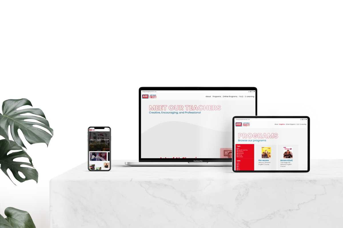
A2Z is the leading English teaching institution that harnesses the power of technology and standard curriculum to provide students with a superb education experience.
At first, I approached A2Z with the idea of rewriting their website and polishing their web presence. They later agreed with the purpose of promoting their online services. I took on design, programming and writing Ci/CD scripts. The result is current website.

A2Z’s website was quite a challenge since the institution was situated in Yemen and Yemen is notorious for having very slow Internet connections. We are talking speeds up to 4 MB/s on a good day and 1 MB/s on a normal day, at-least that’s what the internet service provider advertises, real life speeds are sometimes as slow as 256 kilobytes. Yes, seriously, 256 kilobytes per second.
Consequently, compromises had to be made for the website in-order to make it load fast for the main userbase. One of them involved using Alpine JS instead of React, Vue or even svelte for any JavaScript-related functions, such as the presentation in the homepage.
Other compromises were also made in the choice of the image format. All PNG, JPG files were converted into WebP because of its excellent quality and relatively low size. For reference, the following image had reduced its size by 50%.

JPG: 156k
magick convert sample-image.jpg -resize 1200x -sampling-factor 4:2:0 -strip -quality 85 -interlace JPEG -colorspace sRGB sample-image-small.jpg
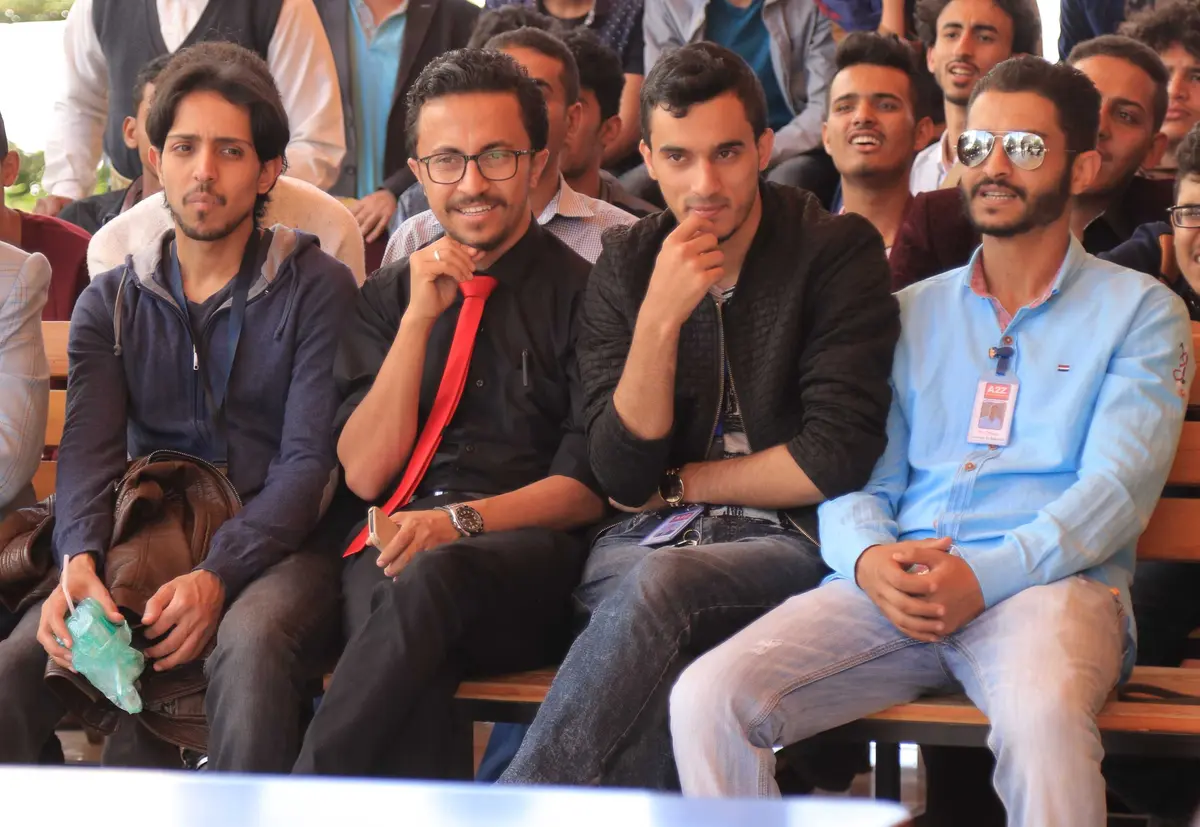
WEBP: 76k
magick convert sample-image.jpg -resize 1200x -define webp:loseless=true -quality 75 sample-image-small.webp
Further optimizations included using the GZIP and Brotli algorithms which reduced the files size by 75%. Tailwind CSS specifically was 9.3KB and became 2.5KB (GZIP) and 2.2KB (Brotli).
Unfortunately, PageSpeed does not recognize these optimizations due to two changes made in the final production build:
In hindsight, I should’ve annoyed the IT department in A2Z enough times in-order to support using the precompressed brotli and gzip files. Moreover, I should’ve used JavaScript to set the Facebook embeds to load after a second or two.
Fortunately, Facebook is used regularly by Yemenis which meant that most of the assets were already cached which meant that pages were a lot faster than what is displayed on PageSpeed.
With taking on this project, I had a lot to discover in UI. One thing that I wish I knew sooner was how to utilize background transitions. By background transitions, I mean the extra sprite before a section. It made all the difference to my eyes and I wanted to incorporate as many background transitions as I could.
I came about getwaves.io which provided very beautiful waves that can be used to transition between sections. This is heavily utilized in the footer of each page as well as the meet our teachers page.
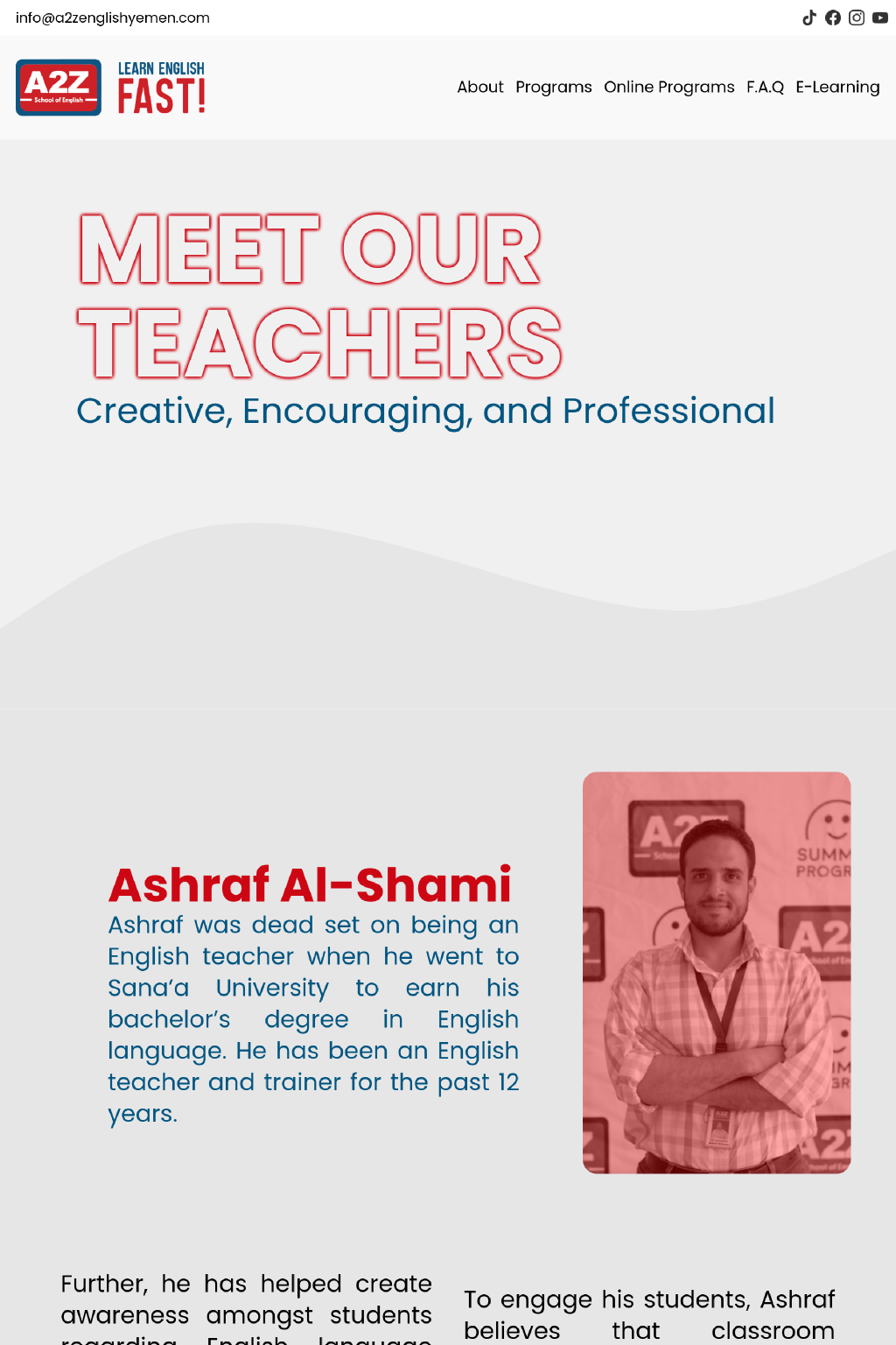
Beyond beautiful transitions, I learned a lot about typography. Some of it came from the then CEO, Ahmed Al Kibsi, as he was very present during the final processes of the website. Most text became justified. Yes, I didn’t know about justified text before the then CEO told me about it.
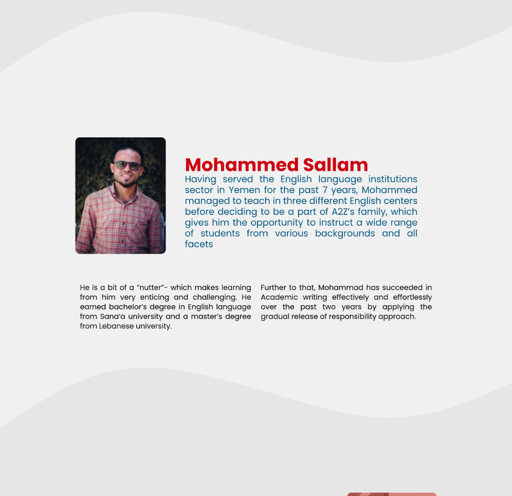
Basic things like adjusting letter spacing and line height was another addition to my bag of design tricks. It is kinda crazy how much letter spacing and line height can affect the readibility of certain texts.
Moreover, I learned one more thing, creating my own svg backgrounds. Inspired by getwaves, I intended to create my own svg backgrounds. The concept was simple, place a couple of education icons, such as books, pens, buses, students on a background and repeat it. After many failed attempts, I consulted A2Z’s then designer and he provided me with an even better idea.
“Why not make the icons big enough, in a square viewport and color the odd icons with jeans and the even ones with wine”.
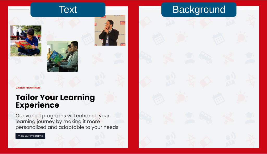
Voilà, isn’t that beautiful? I know it may not seem like a big deal but it made all the difference to me. This is probably the proudest thing of the project so far because I learned how to use a vector graphics editor.
For those looking for a vector graphics editor beside Inkscape or Adobe’s Illustrator, I really recommend BoxySVG. It was a joy to work with and I created that beautiful sprite with it.
It doesn’t even need tutorials, just pop open a new document and mess around, you’ll probably produce something you haven’t thought about before.
With A2Z, it was a wonderful journey from sketching the website until finally deploying it. It is actually surreal that it came about because I had contacted the then managing principal at the time with the idea and she shot it down at first. Some 2 months later, they requested that same website and I was already done with it; because I prepared it in the original proposal. What was left was matching the CEO’s vision of the website and the final product which was a wonderful experience.
Overall, I am grateful I had the chance to work with A2Z and I wish them good luck in their ventures. For people in Yemen, give A2Z a visit, it is a really fun, professional and enaging environment.